
Weekly Filet #200: Beauty in pieces. And more.

1. Species in Pieces
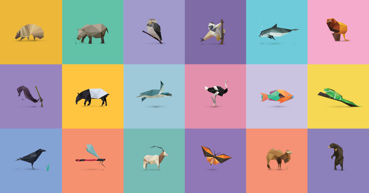
A stunning interactive exhibition of 30 of the world’s most interesting but endangered species. What I find fascinating here beyond the sheer beauty of it: The creator, Bryan James, manages to evoke an emotional reaction to animals that are made of nothing but polygons. If you know a little something about the web, learning that all of these creatures are made purely with CSS makes this even more impressive.
2. First and Final Frames (Vimeo)
55 movies, first and final seconds, side by side.
3. The Secret Lives of the Tiny People In Architectural Renderings (Gizmodo)
Did you know the people in architectural renderings are called «scalies»? A great read on something you probably never thought about.
4. The Heart-Stopping Climbs of Alex Honnold (The New York Times Magazine)
I think I stopped breathing while reading this.
5. Landsat-live goes live (Mapbox)
It's not live satellite footage of the world, but we're getting close. While on Google Earth it's always summer, none of what you see on Landsat-live is older than a month – most of it is a lot more recent even.
Recommended by John Burn-Murdoch: Antebellum Data Journalism: Or, How Big Data Busted Abe Lincoln (ProPublica)
ProPublica's Scott Klein delves more than 150 years into the past to tell the tale of US newspaper editor and sometime Congressman Horace Greeley, whose 1848 investigation into congressional travel expenses proved an excellent example of both the power and potential pitfalls of quantitative journalism.

March guest curator: John Burn-Murdoch is a data journalist at the Financial Times in London. He has authored some of the best interactives on sports I've seen lately. My favourite piece of his is on speedy skyscraper lifts, though. You can follow John on Twitter, which you probably should.